
Roz-cuarţ şi albastru-seren sunt cele două culori oficiale desemnate de Institutul Pantone pentru 2016. Culorile acestui an au fost alese astfel pentru a transmite un mesaj puternic, după cum se arată pe site-ul institutului:
„Împreună, rozul-cuarţ şi albastrul-seren dau naştere unui echilibru vizual. Tonurile calde de roz şi cele reci de albastru se combină perfect, reflectând o conexiune, o stare de bine şi un sentiment de pace şi ordine. Totodată, această combinaţie inedită este şi provocatoare, deoarece nu se regăseşte în asocierile tradiţionale de culori. Ţinând cont şi de faptul că în multe părţi ale lumii asistăm la un gender blur (estomparea diferenţelor de gen), cele două culori alese coincid şi cu schimbările din societatea actuală, din modă sau design”, se arată în comunicatul oficial.
Anumite tendinţe revin când în când, dar asta nu înseamnă că trendurile din modă revin exact aşa cum au fost în trecut. Modelele sunt reinventate pentru a veni cu o viziune nouă şi modernă pe lângă conceptul clasic.
Pentru 2016, ECCO a revigorat stilul feminin-chic al anilor ’60 cu o reinterpretare modernă şi îndrăzneaţă a culorilor specifice acelei perioade. O paletă delicioasă şi vibrantă de roz intens, galben aprins şi indigo se pregăteşte să înlocuiască ţinutele monocrome din sezonul rece.
Culorile de top ale anului 2016 sunt îndrăzneţe, vesele şi creează un impact puternic de la prima vedere, dar totodată induc o stare de relaxare şi calm, seninătate şi căldură. Astfel, rozul sugerează gingăşie şi generozitate, iar albastru-seren - relaxare şi escapism. Credemă că o cămaşă office sau casual în culorile anului 2016 poate să desăvârşească o ţinută la birou.
one.ro
Fashion Snoops’ Spring/Summer 16 Color Forecast identifies five key palettes: Backyard, Soft Nostalgia, Seaside, Desert Bloom and Heirlooms. Soft Nostalgia plays the most important role with a continuation of pastels that become notably more saturated. Desert Bloom refreshes the notion of neutrals with new base tones and enticing fashion colors that offer a new perspective. The full report is available in the WeConnectFashion Trend Shop.
SEASIDE - VIBRANT MID TONES PALETTESeaside is presented as a vibrant selection of mid-tones. Bubblegum pink plays an essential role, while newer shades of Coral and Melon are influenced by pink and grapefruit casts. Orchid and Aqua are offered as emerging fashion colors. Custard is lively, yet not overly saturated, shade of yellow. Chartreuse is introduced as a new lime.
CORAL
Coral is a new pink this season, with salmon undertones.
HEIRLOOM - JEWEL TONES PALETTEJewel tones remain relevant for Spring/Summer 2016 with a new offering of Heirlooms. Red and green continue to play the most significant roles, including familiar shades of dark Burgundy and brighter Ruby. Green becomes more influenced by blues with Evergreen and Dark Teal colors. While Navy progresses as an influential base color, Indigo offers a new alternative. Grape purple is featured as a new fashion color.
BURGUNDY
After much success in recent seasons, burgundy is back for Spring.
INDIGO
Indigo presents a strong option somewhere in between navy and cobalt.
DARK TEAL
Dark Teal offers a new fashion color that adds newness especially to retro looks.
DESERT BLOOM - NEUTRALS PALETTEThe Desert Bloom color palette combines earthy neutrals along with emerging fashion colors. Base hues of Khaki, Hazy Taupe and Twine are enlivened by richer bases like Dark Roast and Olive. Red casted Rust and orange casted Copper both play influential roles, while Marigold is a yellow with significant orange influence. Persimmon keeps the palette lively et to pink and orange casts. Cooler hues include Soldier Blue, Moonstone and Pine.
PERSIMMON
Persimmon combines desert orange with pink for a sunset fashion color.
HAZY TAUPE
Hazy Taupe brings a darker grey casted neutral into the spectrum.
MOONSTONE BLUE
Moonstone Blue is an exciting new fashion color in the Desert Bloom palette.
SOFT NOSTALGIA - PASTELS PALETTESoft Nostalgia addresses pastels as one of the most important groups of the season, lead notably by Blue Hydrangea. Chambray offers a greyer, saturated blue alternative. Pink is a focus from saturated mid-tones of Peony to whitened Ice Pink, peach tinted Rose Champagne and purple casted Lilac. Other fashion pastels include more saturated hues of Wisteria purple, Lemon Chiffon and Sea Glass green. Neutral base tones include a fleshy Buff, utility Ecru and Bone. Dust complements Soft Nostalgia as this season’s exclusive grey.
BLUE HYDRANGEA
Blue Hydrangea is easily the most essential pastel of the season, lending a soft commercial appeal.
LEMON CHIFFON
Lemon Chiffon brings yellow to the pastel range with creamy undertones.
BACKYARD - BRIGHTS PALETTEBackyard brights offer a lively conversation anchored by warm and cool hues. Green plays a pivotal role in both Spring Green and a brighter shade of Grass, while Canary offers a brightly saturated yellow. Red progresses forward with Candy Apple as a key color. Another popular commercial option is Electric Blue, while Periwinkle really brings something new to the table. Though orange generally downtrends, Clementine remains.
PERIWINKLE
Periwinkle is one of the most popular blues of the season, positioned as a brighter summer alternative to Electric Blue.
Purchase the Full Report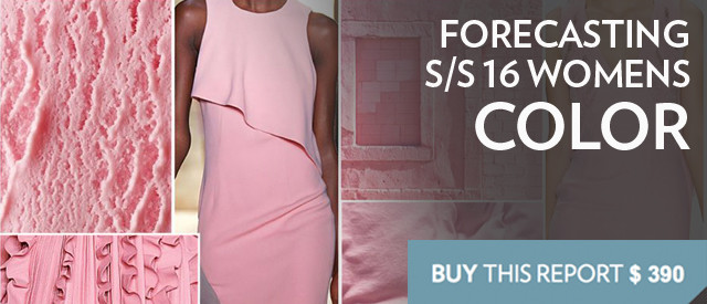
This S/S 2016 Women's Color Seasonal Guide by Fashion Snoops is a comprehensive report, breaking down the key women’s colors & palettes for the Spring/Summer 2016 season. The focus with this report is to demonstrate the most influential color families and combinations as well as direct you to emerging hues.




 deci ma grabesc, inot altadata!